


With the update Google rolled out in 2016, we got our first look at the concept of mobile-first indexing (MFI). Before that update, evaluating a website's crawling, indexing, and ranking meant looking at its desktop version. The 2016 update changed that: Google announced it would start considering the mobile version of websites for crawling, indexing, and ranking instead. Then, with the current announcement in 2020, Google announced that mobile-first indexing (MFI) was now in effect for websites worldwide.
First, I want to walk through the details of the 2016 and 2020 updates.
Looking at the update announcement Google made in 2016, you can trace this update back to the fact that most users now search on mobile devices. Google pointed out that users searching on mobile devices were seeing less content on the mobile page than on the desktop page, and said this update supports one of its core principles, "having the content the user is looking for". Google's main goal here is to make sure that everything on the desktop page, such as structured data, breadcrumbs, and category content, also shows up on the mobile page, so users get access to higher-quality content.
Alongside the 2016 update, Google noted that it was still in its early stages and said mobile-first indexing would roll out to all websites by 2020.
So what is mobile-first indexing, how do you make your website suitable for it, and what should you keep in mind along the way?
What is Mobile-First Indexing (MFI)?
Mobile-first indexing (MFI) is Google using the mobile version of a website for indexing, crawling, and ranking, in other words, for determining how relevant a website is to a given query. Making your website suitable for mobile-first indexing means all the content on your desktop version is also available on your mobile version.
There are two ways to make your website suitable for mobile-first indexing: using a different URL structure, or using the same URL structure. A different URL structure means serving different HTML for each device through a separate URL. With this setup, Googlebot uses the "User-agent" and "Vary" HTTP headers to send users to the version built for their device. If you go with a different URL structure, build it around the "m" subdomain (www.m.example.com). When your mobile version lives under a different subdomain like that, the canonical tags on your mobile pages need to point to the desktop version.
If you're presenting the mobile version on the same URL structure, you'll need either a Responsive Design or a Dynamic Serving setup.
Responsive Design is a web design approach that makes your content look good across the full range of devices and screen sizes. It serves the same HTML code on the same URL, but adapted to the screen size, regardless of which device the user visits from. Google recommends Responsive Design because it's the simplest option for both design patterns and page maintenance, and it also gives you an edge on crawl budget efficiency.

Dynamic Serving serves different HTML and CSS resources on the same URL, depending on the device type. It keeps the same URL no matter which device the user visits from, but unlike responsive design, it doesn't adjust automatically to different screen sizes by device type. Because of that, you may need to make some changes, since your website will look different in size and design between the mobile and desktop versions. In this setup, Googlebot uses the "User-agent" polling method and the "Vary: User-agent" HTTP response header to send users to the right size of HTML.
How to Create a Website Suitable for Mobile-First Indexing?
You can test whether your website is suitable for mobile-first indexing with the mobile-first indexing test tool. So how do you actually create a website that's suitable for mobile-first indexing (MFI)?
Structured Data Control
Every structured data markup you offer on the desktop version should also be available on the mobile version. For example, if you're using an organization schema or an FAQ schema field on desktop, make sure it's also available to users on mobile. You can compare structured data across both device types by running your site URL through the structured data testing tool.
Robots.txt File Control
Robots.txt is a text file that tells search engine bots which pages they can and can't access. Make sure you use the same meta robots tag on both your mobile and desktop versions, and that your mobile version is accessible in the robots.txt file. Otherwise, Google won't be able to reach your mobile site, and that will keep it from being crawled and indexed.
Content Control
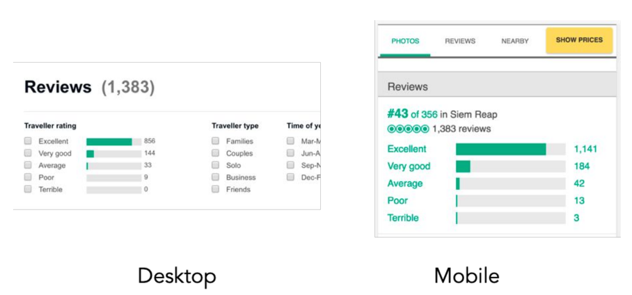
Make sure your mobile and desktop versions carry the same content. If something exists on your desktop version but not your mobile version, add it to the mobile version too. Otherwise, users and Googlebot alike will miss content on mobile that they'd have seen on desktop. Since all indexing now happens based on the mobile site, that gap can cause real problems indexing your content.
Meta Tags Usage Control
Make sure you use the same meta title and description tags on both the desktop and mobile versions of your site.
Visual Content Control
Make sure the images on your mobile site match the quality of the images on your desktop site; don't add lower-quality images just for mobile. Also make sure the image formats you use on mobile are ones Google supports, and that the alt text you use on desktop carries over the same way on mobile.
Video Content Control
Make sure video content from your desktop version is also present on mobile, that the mobile version isn't lower quality, and that it uses formats Google supports. Add video content to the page using <video>, <embed>, or <object> tags.
Product / Content Count Control
Make sure the number of products, or the amount of content, you show users is the same on both the desktop and mobile versions.
Category Content Control
Make sure all the category content on your website also appears on the mobile version. Category content missing from the mobile version won't get indexed.
Breadcrumb Structure Control
Make sure the breadcrumb structure on your desktop version appears in the same place and the same way on the mobile version.
Pagination/ Infinite Scroll Structure Control
Make sure pagination pages or infinite scroll pages work the same way on both the desktop and mobile versions of your website.
Control of Hreflang Links
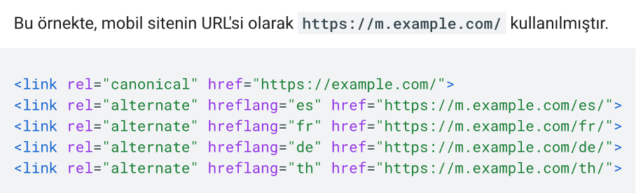
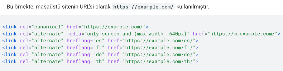
If your mobile and desktop versions use separate URLs, use separate hreflang tags for each: point the mobile version's hreflang tags to mobile URLs, and the desktop version's hreflang tags to desktop URLs.
Here's an example of the hreflang tag markup for the mobile site.
And here's an example of the hreflang tag markup for the desktop site.
Search Console Connection Control
If you're using a different URL structure for your mobile version, connect both your mobile site and your desktop site to Google Search Console separately, so you get accurate data for both versions.
Error Pages Control
Make sure a page shown as an error page on your mobile version is also shown as an error page on your desktop version. Otherwise, the error page on mobile will keep that page from being indexed.
Track URL Control
Fragment URLs are the part of a URL that comes after a #. Since fragment URLs can't be indexed, make sure you're not using them on your mobile version, otherwise the fragment URL will keep that page from being indexed.
Canonical Label Usage Control
If you use a different URL structure for the mobile version, make sure the canonical tags between your mobile and desktop versions are set up correctly. The desktop URL is always the standard URL, and the mobile version URL should point to it.
The URL https://m.example.com/ for the mobile site should use the canonical tag as in the example below.

Site Speed Control
Since Google's update means results now get determined based on the mobile version, mobile site speed matters more than ever. Any site speed improvements you make for the desktop version should be made for the mobile site too.
Mobile-first indexing works heavily in favor of websites that deliver a smooth mobile experience with the same content across mobile and desktop. As Google noted in its update, growing mobile device usage and rising rates of access to content through mobile devices will only make mobile-first indexing (MFI), and the mobile improvements behind it, more important.


