


In this article, I will try to explain how you can analyze the words that we can define as long-tail keywords in R Studio and how the results can be turned into action. In addition, I have added as many useful graphics as possible with their codes for easier interpretation in both reporting and presentations. All the data I show in the article was taken in a certain date range on my blog and my sample is quite high. I will do my analysis only with the "Query" tab in the export.
Why Should We Care About Long-Tail Words?
Long-tail words, despite their low search volumes, give you an advantage in both conversions and understanding your visitors' search intent. These words may not have 5000 search volumes at the local level, but I think you can still use long-tail to reach the most niche target audience. Also, don't forget that you can already create your plans to be included in Google AI Overviews results.

Analysis of Long-tail Words with R
In my analysis, I used the data set exported from the Search Console instead of the API. If you want, you can also get the data as I explained in my article on using R Studio Search Console API. The export can be in the form of Excel or .csv; it depends entirely on your preference. I also used comment lines from time to time to make it easier for you in the code. Classically, we throw our file into R:
library(readxl)
data <- read_excel("Desktop/data.xlsx")
View(data)
I now have the Search Console data I want. You can check it with View(data):

Warning: If you change the name of the column headers in the table, you must also change it in the code, or the code will not work. Also, you may already have some of these packages installed and not want to install them again.
I need to define my long-tail kw in R. For this I need to calculate the length of each word first:
library(dplyr)
data <- data %>% mutate(word_count = str_count(Query, "\\w+"))
Queries of 3 or more words can be categorized as "long tail": (you can do it in 4 if you want)
long_tail_data <- data %>% filter(word_count >= 3)

After the definition of long tail, I can simply calculate the average of the values of long tail words such as click and impression:
summary_stats <- long_tail_data %>%
  summarise(
    avg_clicks = mean(Clicks),
    avg_impressions = mean(Impressions),
    avg_ctr = mean(CTR),
    avg_position = mean(Position)
  )
print(summary_stats)
We got a result like the one below. Looking at the averages for my long tail words, the average position was 6.28, while these words were getting 11.2 clicks on average. I could pull a lot more outputs, like the median of these words, but I wanted to keep the explanation simple:

Impression and Click Information of Long-tail Words
With ggplot2 we can visualize the distribution of click and impression metrics:
library(ggplot2)
ggplot(long_tail_data, aes(x=Impressions, y=Clicks)) +
  geom_point() +
  geom_smooth(method="lm") +
  labs(title="Long Tail Keywords - Impressions vs Clicks")
By identifying well-performing long-tail words, you can develop new content strategies. As a natural result of this, most of the words will already cluster near the points closest to 0; our goal is to identify the ones that are valuable to us:
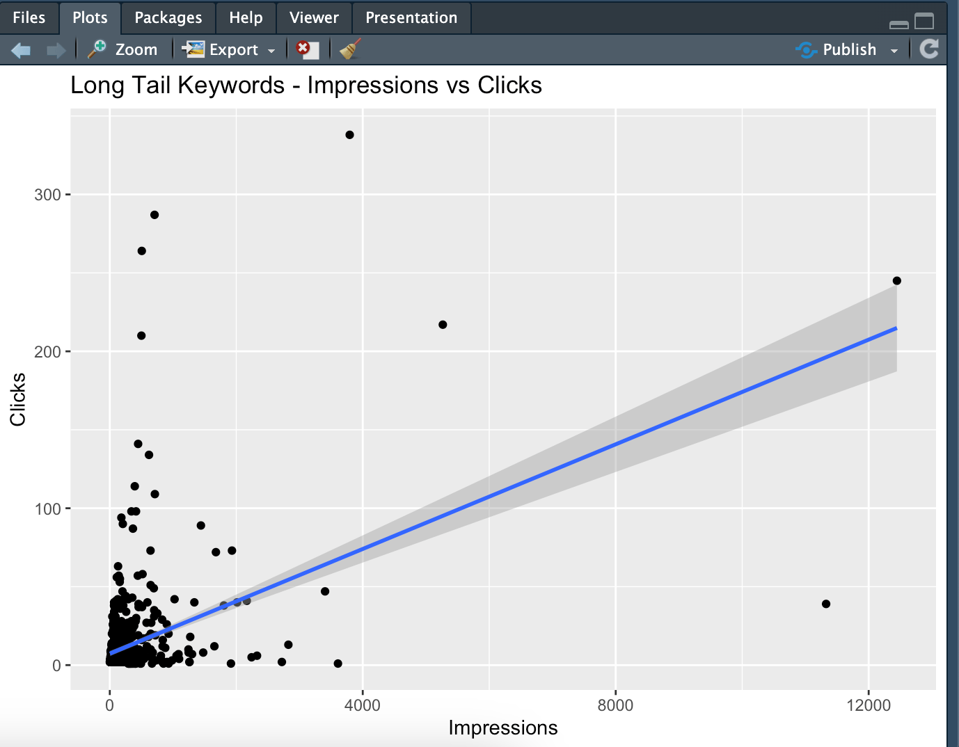
In addition to this graph, we can create a slightly more detailed graph.
With the regression line, you can see how the number of clicks changes as the number of impressions increases. A positive slope indicates that clicks increase as impressions increase, but if the slope is not too steep, the increase is limited.
The colors of the dots represent CTR. Yellow colors indicate low CTR and red colors indicate high CTR. Check whether the red, high-CTR dots tend to cluster at low impression levels or high ones. This will help you understand how influential certain keywords are on impressions:
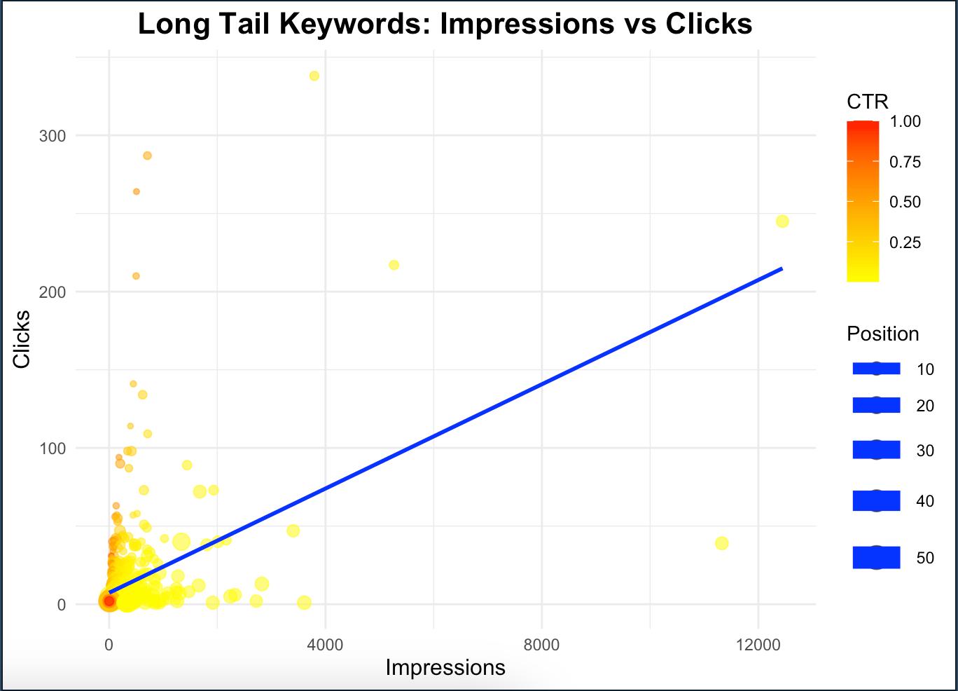
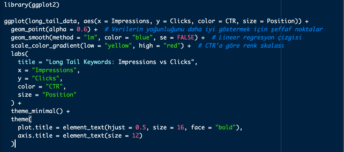
Codes to create this graph:
library(ggplot2)
ggplot(long_tail_data, aes(x = Impressions, y = Clicks, color = CTR, size = Position)) +
  geom_point(alpha = 0.6) +  # Verilerin yoğunluğunu daha iyi göstermek için şeffaf noktalar
  geom_smooth(method = "lm", color = "blue", se = FALSE) +  # Lineer regresyon çizgisi
  scale_color_gradient(low = "yellow", high = "red") +  # CTR'a göre renk skalası
  labs(
    title = "Long Tail Keywords: Impressions vs Clicks",
    x = "Impressions",
    y = "Clicks",
    color = "CTR",
    size = "Position"
  ) +
  theme_minimal() +
  theme(
    plot.title = element_text(hjust = 0.5, size = 16, face = "bold"),
    axis.title = element_text(size = 12)
  )
Word Cloud Creation
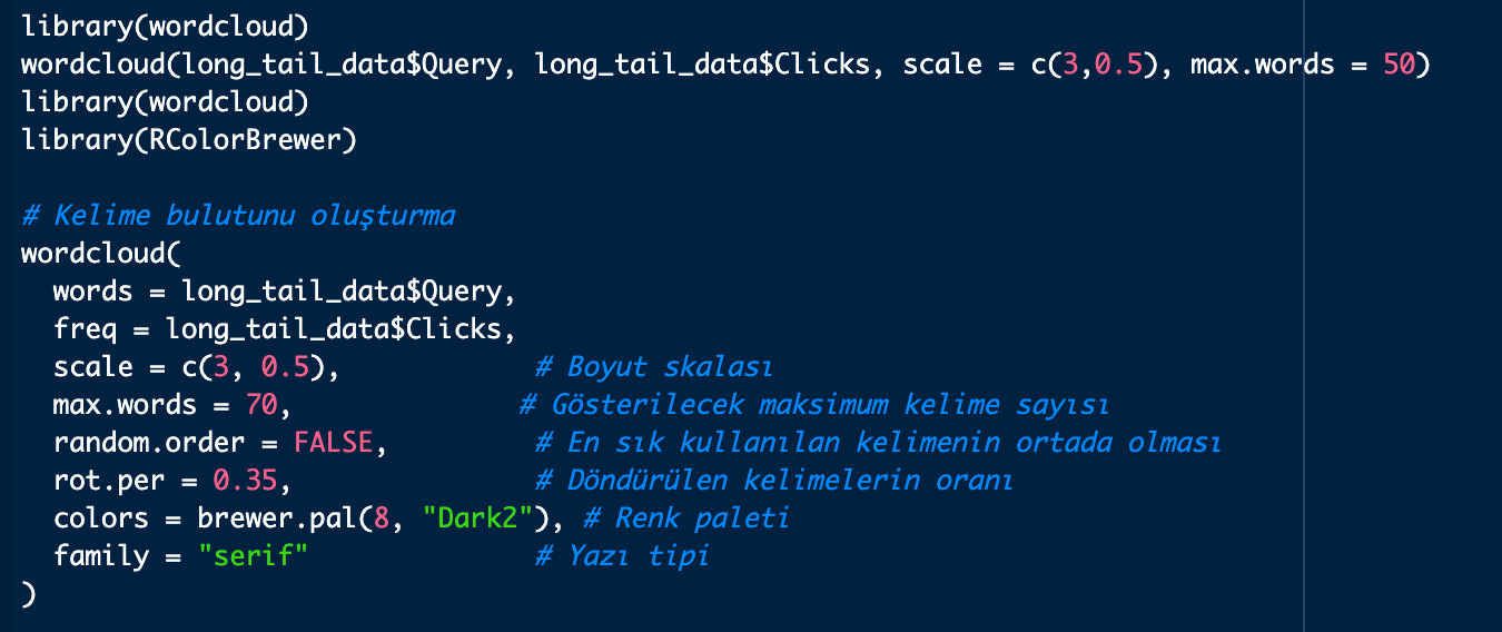
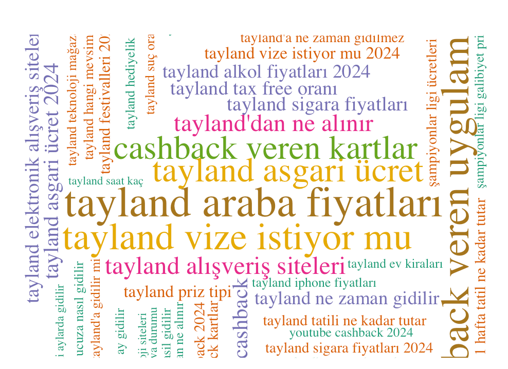
You can use the wordcloud package to create word clouds. The scale = c(3, 0.5) parameter below determines the size of the words.
- 3: Sets the size of the largest word in the word cloud. The number 3 here represents the size of the most clicked/shown word.
- 0.5: Determines the size of the smallest word in the word cloud. The number 0.5 here represents the size of the least clicked/shown word.
library(wordcloud)
wordcloud(long_tail_data$Query, long_tail_data$Clicks, scale = c(3,0.5), max.words = 50)
library(wordcloud)
library(RColorBrewer)
wordcloud(
  words = long_tail_data$Query,
  freq = long_tail_data$Clicks,
  scale = c(3, 0.5),
  max.words = 70,              #Gösterilecek maksimum kelime sayısı
  random.order = FALSE,         #En sık kullanılan kelimenin ortada yer alması
  rot.per = 0.35,               #Döndürülen kelimelerin oranı
  colors = brewer.pal(8, "Dark2"), #Renk paleti
  family = "serif"              #Yazı tipi
)
Sample output: (you can display this quite differently; there's room to play around in the code)
Correlation Heat Map
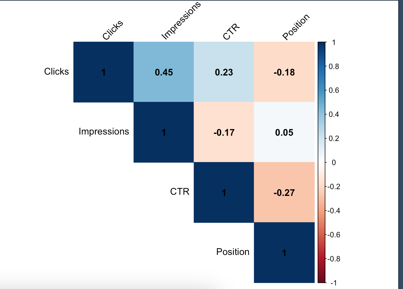
Correlation heatmaps can be used to see the relationship between long tail words and different metrics (clicks, impressions, CTR) and as a result, you can create a correlation matrix. I already explained what correlation is in my previous article.
According to the matrix:
Correlation between CTR and Position: There seems to be a negative correlation between CTR and Position. That is, an increase in average position (e.g. closer to the 1st position) increases CTR. This is usually expressed by a negative correlation coefficient.
Correlation between Impressions and CTR: There seems to be a generally low and negative correlation between Impressions and CTR. Words with high impression counts may not always have a high CTR because they may not be targeted in terms of meta tags as they appeal to a wider audience:
Related codes:
if (!require("dplyr")) {
    install.packages("dplyr")
    library(dplyr)
}
if (!require("magrittr")) {
    install.packages("magrittr")
    library(magrittr)
}
library(corrplot)
numeric_data <- long_tail_data %>%
  select(Clicks, Impressions, CTR, Position) %>%
  cor()
corrplot(numeric_data, method = "color", type = "upper",
         tl.col = "black", tl.srt = 45, addCoef.col = "black")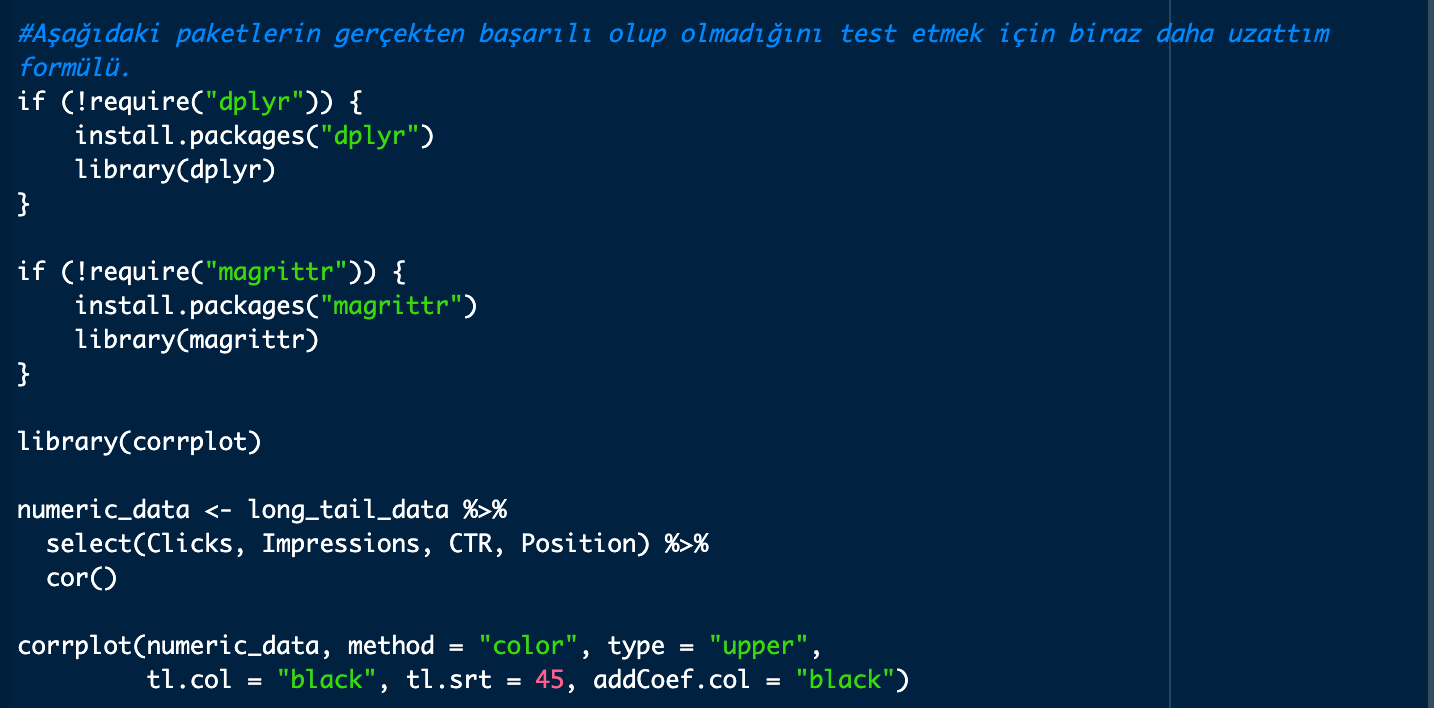
Long-tail Keywords Click Distribution
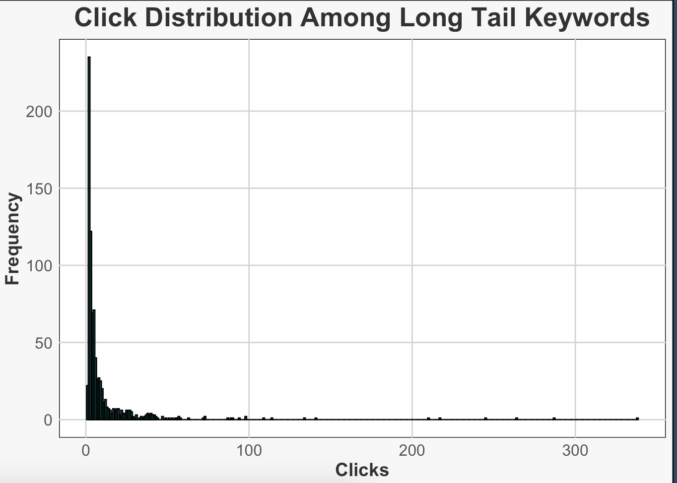
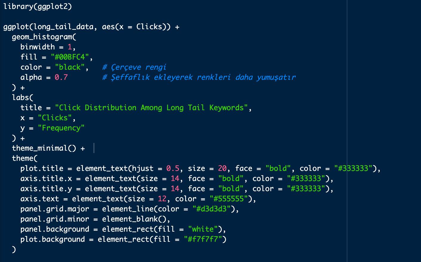
With this graph we can see how clicks are distributed for long-tail words. Usually, fewer clicks are expected for long tail keywords, which may cause the histograms to be a bit longer and larger than normal. The graph below shows that the choice of long tail is correct according to our definition and the clicks are again very few, as expected. Our goal, again, is to identify these words, make sure they're included in the content plans, and look for possible improvements in meta tags or heading tags to increase CTR:
library(ggplot2)
ggplot(long_tail_data, aes(x = Clicks)) +
  geom_histogram(
    binwidth = 1,
    fill = "#00BFC4",
    color = "black",   # Çerçeve rengi
    alpha = 0.7        # Şeffaflık ekleyerek renkleri daha yumuşatır
  ) +
  labs(
    title = "Click Distribution Among Long Tail Keywords",
    x = "Clicks",
    y = "Frequency"
  ) +
  theme_minimal() +
  theme(
    plot.title = element_text(hjust = 0.5, size = 20, face = "bold", color = "#333333"),
    axis.title.x = element_text(size = 14, face = "bold", color = "#333333"),
    axis.title.y = element_text(size = 14, face = "bold", color = "#333333"),
    axis.text = element_text(size = 12, color = "#555555"),
    panel.grid.major = element_line(color = "#d3d3d3"),
    panel.grid.minor = element_blank(),
    panel.background = element_rect(fill = "white"),
    plot.background = element_rect(fill = "#f7f7f7")
  )
Keyword Heatmap
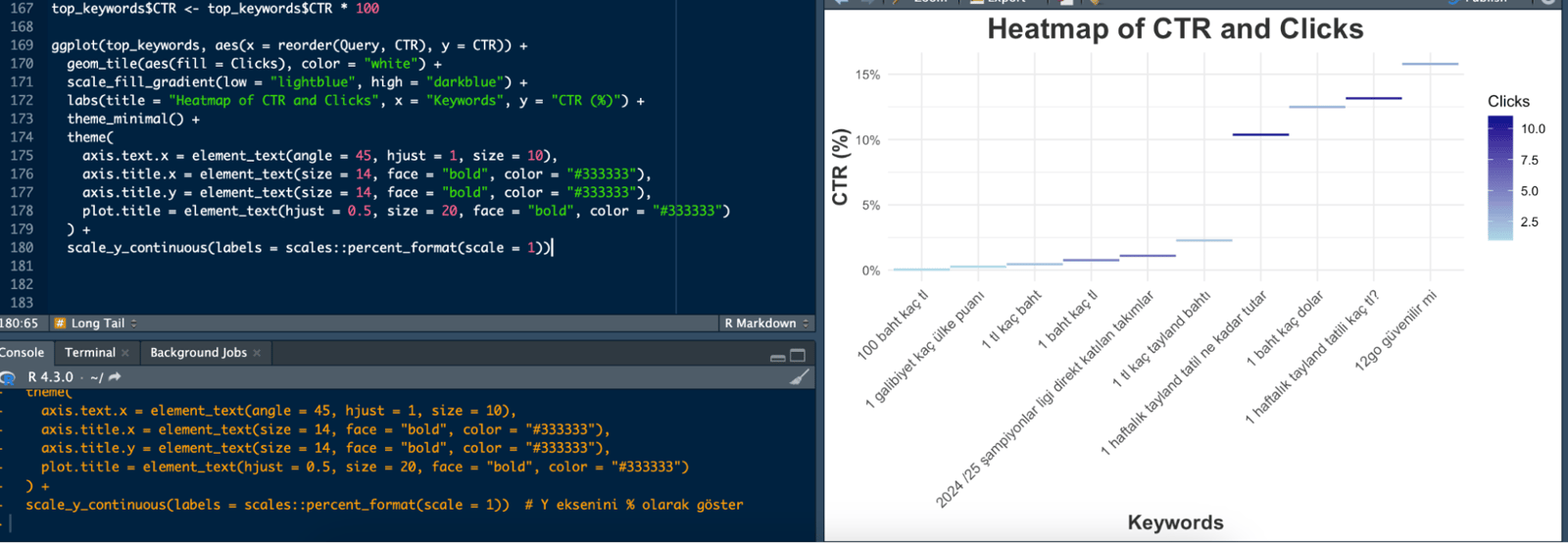
You can quickly see the CTR and click values of long-tail words. The very dark purple ones in the graph indicate a high number of clicks. I created the graph for just the top 10 words as an example; if you put all the words on the graph, it becomes meaningless:
top_keywords$CTR <- top_keywords$CTR * 100
ggplot(top_keywords, aes(x = reorder(Query, CTR), y = CTR)) +
  geom_tile(aes(fill = Clicks), color = "white") +
  scale_fill_gradient(low = "lightblue", high = "darkblue") +
  labs(title = "Heatmap of CTR and Clicks", x = "Keywords", y = "CTR (%)") +
  theme_minimal() +
  theme(
    axis.text.x = element_text(angle = 45, hjust = 1, size = 10),
    axis.title.x = element_text(size = 14, face = "bold", color = "#333333"),
    axis.title.y = element_text(size = 14, face = "bold", color = "#333333"),
    plot.title = element_text(hjust = 0.5, size = 20, face = "bold", color = "#333333")
  ) +
  scale_y_continuous(labels = scales::percent_format(scale = 1))
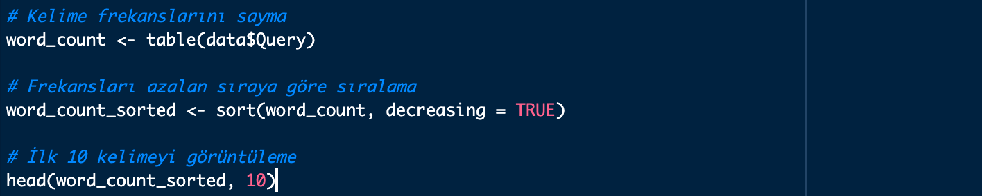
If you want, you can find the frequency values of the words and sort them as follows:
Interactive Long Tail Keywords Plot
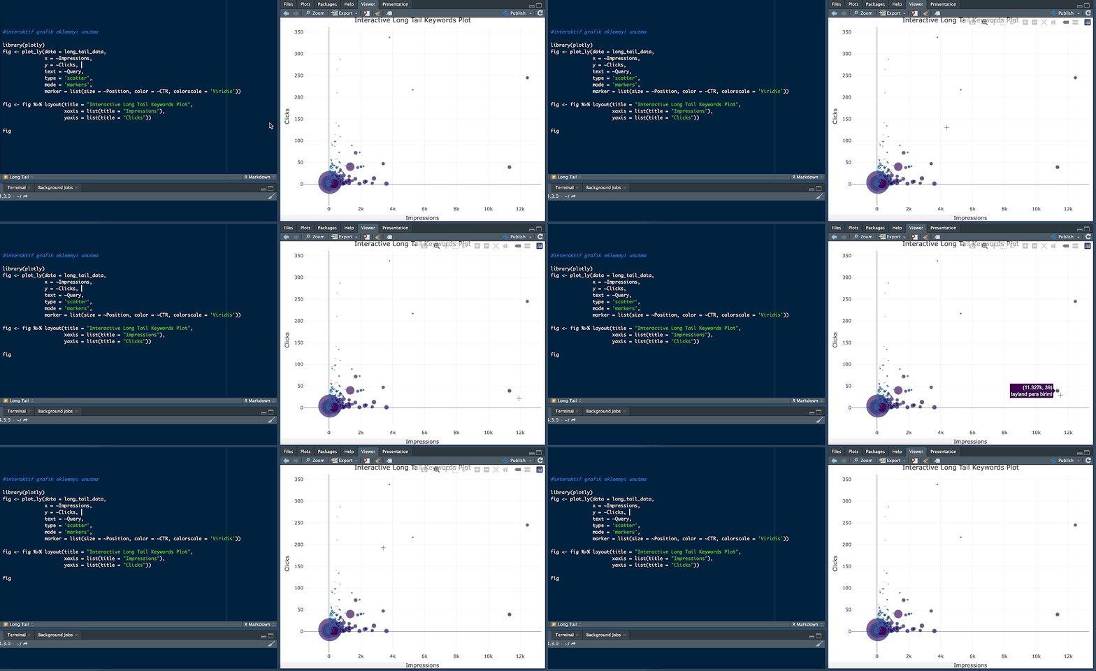
You can use this chart type if you want to examine the words interactively by hovering over the dots on the chart. The colors of the dots indicate the CTR. Words with a high CTR are usually colored in warmer colors. You can examine whether words with a high CTR are generally in better positions or within a certain range of impressions. Dot sizes represent position. A larger dot usually indicates a better position. In this case, you can see which words are in better positions and compare their performance.
For example, the word "thailand para birimi" (“thailand currency”) received 11,327 impressions and 39 clicks:
library(plotly)
fig <- plot_ly(data = long_tail_data,
               x = ~Impressions,
               y = ~Clicks,
               text = ~Query,
               type = 'scatter',
               mode = 'markers',
               marker = list(size = ~Position, color = ~CTR, colorscale = 'Viridis'))
fig <- fig %>% layout(title = "Interactive Long Tail Keywords Plot",
                      xaxis = list(title = "Impressions"),
                      yaxis = list(title = "Clicks"))
fig
I hope I was able to explain how you can identify long-tail words and how you can use them in your content work after visualizing them. I think you can get very good returns when you identify even just a few words from this data and update your content. See you in other R and statistics articles :)


