


Understanding SEO success and SEO-related information through data is becoming more important every day. While it's possible to get some exploratory graphs using Google Analytics (GA from now on), data analysts often turn to other sources to visualize GA data and get better insights into SEO success. Another reason for that is that GA visualizations are really just a sneak peek for reporting purposes. Even though you can build some advanced graphs in GA, you can't export those reports. That's where R functions like ggplot and plotly come in handy.
R and GA data for Beginners
Before I start using the ggplot and plotly packages, I want to point you to this content to get started with R and access GA data via the API. If you don't have an Analytics property, don't worry: you can use this link to access the demo account Google provides. You don't need a website to gather data, and even if you do have one, you might not want to use its data to start analyzing, since without enough traffic, you won't have sufficient information to work with. That can keep you from properly testing the ideas you have. With these two links, you can start doing your own analysis.
A Simple Visual with GGplot
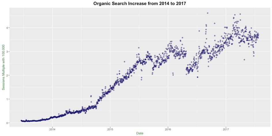
Of course, the best way to understand improvements in search rankings is to look at organic search traffic. I used the organicSearches metric directly from the Dimension & Metric Explorer. This metric gives slightly different counts than segmenting Sessions by Organic Searches inside GA, but for the sake of visualization, it works just fine for now. In this tutorial, we'll use a content-based website. First, we can create a simple graph with ggplot in R. Here's the code for it and the resulting graph:
g <- ggplot(ga_data, aes(date, organicSearches)) + geom_point() g
To make the graph nicer: we can adjust the y axis by dividing it by “100.000”, put a title on top and center it, add some blurriness for the crowded places, and change the color of the dots.
Here's our plot again, this time for Organic Searches on our content website:
g <- ggplot(ga_data, aes(date, organicSearches / 100000))
+ geom_point(color = "midnightblue", alpha = 0.5)
+ ggtitle("Organic Search Increase from 2014 to 2017")
+labs(x = "Date")+labs(y = "Sessions Multiple with 100.000")
+ theme(plot.title = element_text(size = 15, face = "bold", hjust = 0.5,family="Arial"),axis.title.x = element_text(family = "Arial", color="forestgreen", vjust=-0.35),axis.title.y = element_text(family = "Arial",color="forestgreen" , vjust=0.35))
g
Next, we're going to check yearly SEO success. Here we want to see whether our content-based website performed better over the years, and we'll use Plotly for this. SEO Performance Year by Year First, let me show you the first five rows of our data set.
> head(ga_data) date organicSearches 1 2013-06-18 9523 2 2013-06-19 9368 3 2013-06-20 8615 4 2013-06-21 8803 5 2013-06-22 7876 6 2013-06-23 6662
here you can see we have dates and organic search counts. Now we need to group our dates and sum the organic search counts by year, so we'll need the lubridate function by Hadley Wickham.
> library(lubridate)
With the lubridate function we can extract the year part of our dates with year(ga_data$date). Then with this line of code:
> sum(ga_data[year(ga_data$date) == 2014,]$organicSearches)
this lets us count the organic searches from 2014 onward, and so on.
years <- c("2014", "2015", "2016","2017") counts <- c(sum(ga_data[year(ga_data$date) == 2014,]$organicSearches), sum(ga_data[year(ga_data$date) == 2015,]$organicSearches), sum(ga_data[year(ga_data$date) == 2016,]$organicSearches), sum(ga_data[year(ga_data$date) == 2017,]$organicSearches))
growth <- data.frame(years,counts)
> growth years counts 1 2014 22510804 2 2015 83490723 3 2016 106399551 4 2017 75052130
Here we've created a data frame from years and counts. Here's what it looks like:
library(plotly)p <- plot_ly(growth, x = ~years, y = ~counts, type = 'bar', name = 'Sessions') p
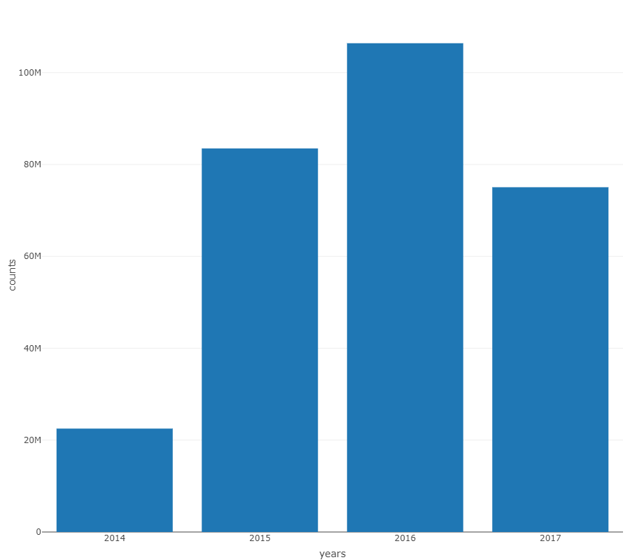
Unlike ggplot, plotly doesn't require any real editing on top of the basic graphs. It automatically sets the y axis in millions, and it's interactive. Here we can see this content website grew 400% in 2015. Growth continued in 2016 with 20M. And as of August 2017, it looks like the growth will continue toward 125M, 20M more than the previous year. (Or more?)
Monthly Organic Traffic
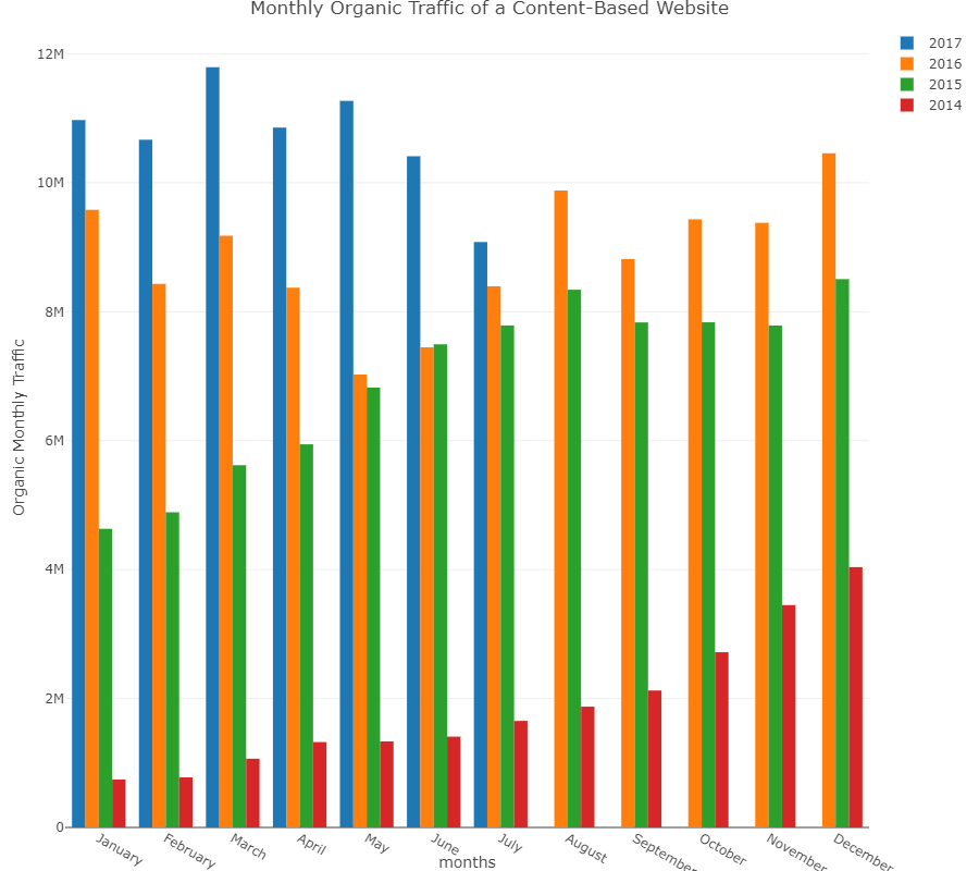
We might wonder about monthly traffic. The question here is whether we'll see seasonality in the data across years. From here, maybe we can comment on the missing part of 2017, since that's still in the future. We can also see the development of the web site on a monthly basis. To get the monthly data easily, you need a little bit of coding skill. You can take the monthly totals for every year again using the lubridate function:
> month(ga_data$date)
gives us the month of the year. After visualizing the monthly traffic data:
https://chart-studio.plotly.com/create/?fid=chapa_ai:5
So I don't see any seasonality in the monthly data. This is most probably because this web site grew very quickly in 2014 and 2015. In 2016 and 2017 there are some increases and decreases but it's hard to tell. For the missing part of 2017, maybe we can say that there will be some increase in August. It looks like it will land around the 10M line for the upcoming months. Finally, it's obvious that this web site grew every month and the growth is still going on in 2017. It's also possible to see a sneak peek of the monthly data in GA. You can compare two years on a monthly basis with Organic Searches segmented on. But it is not possible to have a histogram comparing years and months in the same graph. This is why tools like R Studio and packages like ggplot and plotly are very useful for GA data visualization.


