


Multimedia Content Creation
Infographic & Data Storytelling
Numbers that click into a shape someone remembers: accurate, annotated, and readable whether or not the reader can see it.
Data means nothing to a reader who can't picture it. Infographic & Data Storytelling turns a dataset, comparison, or process into a chart and narrative someone can take in at a glance, with accurate encoding, plain annotations, and alt text that carries the same story to a screen reader. You walk away with a chart whose numbers check out, an encoding that does not mislead, alt text that tells the same story, and every size your channels need.

Some of the 500+ brands we've worked with
Selected brands we’ve worked with across industries.





































 AVVAGlobalCase Study












On this page
How we run it
How we build the story around the numbers
We start from what the data says, then find the shape that says it clearly.
Get clear on the one thing this should teach someone
A chart trying to say five things says none of them well, so we pick the single comparison, trend, or relationship the visual needs to carry. An analyst signs off on the one-sentence takeaway before anyone sketches a chart.
One sentence describing the core takeaway.

Check the data itself
We check units, sample size, time period, and what's excluded. That confirms what the numbers can honestly support before anyone starts designing. A person who knows the data confirms the sample size and caveats before design starts. A cleaned-up spreadsheet isn't the same as a verified one.
A verified data table with sources and caveats attached.

Choose an honest visual encoding
The chart type has to match the claim: a bar chart for comparison, a line for change over time. It also has to work without relying on color alone. A designer checks the chosen encoding against the claim it's making before it moves to annotation.
A visual draft with the encoding decision explained.

Write the annotations and alt text together
The labels, callouts, and alt text get drafted at the same time, so someone using a screen reader gets the same story as someone looking at the image. An editor reads the alt text against the finished visual to confirm a screen reader gets the same story.
A near-final version with full annotation and alt text.

Ship the sizes each channel needs
One master version becomes the crops and formats each channel uses: social, deck, report, without breaking the story along the way. Someone checks every exported crop still carries the story before it ships to a channel.
The final asset set plus a short note on where each version fits.



The chart still needs someone who understands the data
A model may accept a truncated axis, a cherry-picked date range, or a color choice that hides a pattern from colorblind readers because the result looks tidy. We use it for the repetitive work around the decision, such as cleaning a spreadsheet, trying five layouts, and drafting annotations. Then someone who understands the data checks what each visual choice implies. If the honest version is plainer, that is the version we publish.
What you get
What lands in your hands
You get the finished visual, but also the data underneath it and the reasoning that shaped it.
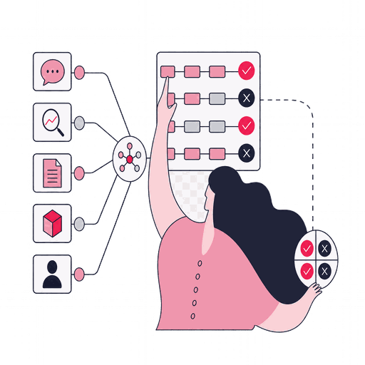
The verified data table
Every number behind the visual, with its source and any limitation noted, so nobody has to take the chart on faith.
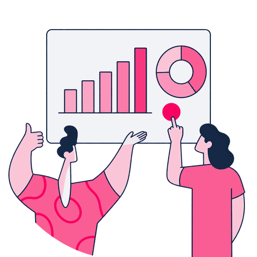
The finished infographic
The core visual asset, encoded honestly and annotated in plain language, ready to publish.

Full alt text and accessible copy
A written version of the same story for screen readers and anyone browsing with images off.

Channel-sized exports
The crops and formats you'll post: social card, deck slide, print, all pulled from one master file.


We call it done when: the numbers check out, the encoding doesn't mislead, the alt text tells the same story, and you have every size your channels need.
Who it fits
The dataset needs a clearer shape
This fits a number, comparison, or process that's real but invisible until someone draws it. If the data itself still needs validating, that's a separate job that comes first.
A good fit when
- You have real numbers, survey results, usage data, a trend line, but nobody outside the team can picture what they mean.
- A process or comparison takes three paragraphs to explain, but one accurately labelled chart would let readers see the relationship at a glance.
- Readers need to save, cite, or reuse the finding, but a text-only explanation gives them no standalone visual with a source and clear takeaway.

Better handled as other work when
- The data hasn't been checked yet. Sourcing and validating the numbers comes first, as its own step.
- Honest encoding would undermine the point the chart is meant to make, because the result only looks strong on a flattering axis, date range, or comparison.
- The research question, sample, or survey still needs designing, so there is no verified finding for an infographic to explain yet.
People who write and ship this content
Some of these consultants write the pages themselves. Others plan distribution or check how a piece performs once it's live, so the team below covers more than one stage of the work.

Samet Özsüleyman
SEO Manager

Zafer Yıldız
Web Analytics Manager

Metehan Urhan
New Business & Partnership Manager

Hande Parmaksız
SEO Manager

Sena Önder
Senior SEO Executive

Elif Naz Akan Karakoç
Senior SEO Executive

Bensu Tınastepe
Senior SEO Analyst

Gülşah Şahin Özkan
Senior SEO Analyst

Ali Özgün Öz
SEO Executive

Ruhan Tiryaki
Senior SEO Analyst

Emir Kağan Kahveci
SEO Analyst

Mirzamin Aghazada
UI/UX Designer

Mehmet Aktuğ
Co-Founder & COO
Tools we use
Tools behind this work
 Datawrapper
builds the chart itself with a real alt-text field attached, not added after
 WAVE
WAVEthe final check on the embedded asset, not the source chart file
 OpenRefine
cleans and clusters the raw dataset before a single shape gets chosen
 Coblis
shows how the finished chart actually looks under color vision deficiency
 Canva
Canvaproduces the per-channel sizes from the one approved chart, nothing redrawn
Where this leads next
Methods connected to Infographic & Data Storytelling

Upstream
Video Script Writing
If the story needs a voiceover to walk someone through it, the script gets written before the visuals lock.

Downstream
Interactive Content Creation
Once the static story lands, data that's rich enough for people to explore themselves becomes a tool instead of just a chart.

Complementary
Video Content Creation
The dataset behind a static chart can also carry a video's narration, reaching viewers who'd rather watch a story than pause to read one.


Start the work
Got a dataset nobody outside the team understands?

Before we start